Evaluation
Context:
These 4 projects have been a part of a promotional campaign, design to promote a product/service/topic. This isn't meant to be from the creator's point of view, but rather as an independent advertiser. It should highlight the main features of the topics, and portray them in a way that would bring in a bigger audience from a specific target audience. All 4 pieces should work in tandem, complimenting each other, despite being vastly different in their formats.
Purpose of the work:
The campaign was intended to reach the target audience of the product/service/topic and inform them about it. This is done by the production of 4 different assets. A double-page spread that can be featured in something like a magazine where the target audience may hear about it from someone who reads magazines, possibly an older family member. A viral video that appeals to the target audience. It should help inform the viewer about the topic, while also having extra parts so it doesn't seem like a full-on ad. A radio advert that informs the target audience about the topic without the need for visual aids. It should be able to carry it's own weight by being interesting. Finally, there should be a website promoting the topic, providing any links and information that are pertinent to the topic.
I do believe that my campaign would work because the topic, OnePulse, is about embracing people's different opinions. The different formats and messages of the campaign highlights how different the opinions are but still can be related to by the target audience of the campaign.
Main points:
I created a Double-Page Spread, Viral Video, Radio Advert, and Promotional Website for the campaign. They were supposed to be in vastly different forms of media as to reach as many people as possible. This would increase the exposure towards the target audience.

The viral video is on the popular video-sharing site YouTube, this straight away opens it up to 2.84 billion people a month. The majority of these, are the target audience and have access to OnePulse as well. This allows for it to reach the intended audience directly.
Radio Ad Audio File
The radio ad can be heard by people while in a car or just out and about. This means that people aren't necessarily paying attention. This means it is passive, so they may think about for a while without realising. This builds a brand preference without their knowledge.
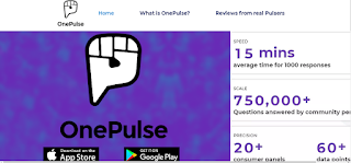
Website
When opened, the website shows straight away where the visitors can get OnePulse. Statistically, the majority of these would be on a phone that supports it so they could look at it for themselves.
Initial assessment:
For this campaign, I did learn a few skills, including re-timing clips, adjusting the volume after recording and how to create an advertorial. I think that my time was spread appropriately over each project, as I only did two at a time. I got the simpler one out of the way first, then dedicated more time to the one that needed it to get to a good enough quality. The Radio Advert, for example, just involved placing the sound effects and voices in the multitrack window, adjusting the volume, and panning, then finalising the equalisation. This made it not too loud or quiet. I then was able to focus on the website which involved getting all the assets in the right place.
Critical evaluations:
I do think that the setting of the Radio Ad might send the wrong message, comparing the app to a police interrogation. OnePulse is designed to make people feel guilt-free about sharing their opinions, but the setting could make them feel pressured to get the app and answer the questions.
The Viral Video could have been closer to a more standard advert, instead of having a small bit at the end. Another option is to keep the same format, but spread the advertising throughout. This would more closely associate it to the product.
I feel the Advertorial would be somewhat successful, but the colours probably could've been adjusted, to make them less harsh, and adjust the formatting of the text to make it less uniform and interesting to look at.
The Website, I think works the best but could probably do with some more information.
Techniques used:
I've learnt the basics of Audition, InDesign, and wix.com.
Audition:
I learnt how to adjust the volume of clips after they've been recorded, as well as the panning of the clip. Panning is how far into each ear the (stereo) sound will go. This helps to position things in soundscapes. I also learnt how to apply a parametric equaliser, bringing down the highs and making it easier on the ears. I also learnt how to scale clips, according to speed, allowing for the final clip to sound how I wanted.
Indesign:
I learnt how to create the layout of the Double-Page Spread, and place in text and images. For text, you create a text document with no formatting, and then "place" that in a box drawn in InDesign. This is the same with images.
With Wix, I learned how to select a template and then adjust it according to what I want. I learnt how to do animations, change page backgrounds, edit page names and therefore the menu at the top. I also linked various images to different websites relating to it. I also added animations to certain features, making it softer on the viewer.
For the viral video, I used photoshop to create various assets featured in it. I also used
sub-sequences in Premiere to make it easier to adjust different elements without impacting the rest of the timeline. Other skills in Premiere include importing assets into bins, stabilising clips, cutting clips, adjustment layers, and using the curves effect to increase the reds.
Supporting arguments:
I would say my Viral Video worked, as my peers, who are also my target audience, said they enjoyed it because of the over-the-top anger.
The advertorial, according to my peers, said it would encourage them to get the app and at least try it. They said that it was explained in a way that made it seem great and effortless.
There are lines in the radio advert that the target audience found amusing which helped keep their attention. The dramatic change in tone towards the end also kept their attention, according to them.
Usefulness and relevance of the final work:
I would say the final outcome was relevant to the task because I intended it to be as close to a real advertisement that the creators of OnePulse could put out. I tried to use the colours as much as possible and give as much information as possible. Promotional campaigns are designed to help influence the consumer into interacting with the product/service/topic in one way or another. I feel that because the 4 pieces of work are in such different formats, it would reach more people than they would do if they were all the same.
Examples to support:

(PEER)
My Viral Video acts as a skit to help people understand what sort of thing the app is. It isn't meant to be taken seriously, but there are feelings that will get hurt. That's the idea of the app: give opinions, regardless of whether you will hurt someone's feelings or not.
My peer's work features him playing along to "The Chain" by Fleetwood Mac on a bass guitar from the company his campaign is on. The bass line that's prominently heard in the video, is played by his guitar and not that in the song itself. This is to show the sound of the guitar which would be a deciding factor for potential buyers of a bass guitar.
The setting for my viral video is a game show, which I thought would be fitting because they're all about guessing the right answer, even when you think it may be wrong. The twist with the game show, which is explored in the video, is that all their opinions are valid. Some would be upset by this, being able to see the face of someone with a different opinion to theirs. The fact that the app is anonymous, removes this interaction and keeps everyone calm.

(Mine)

(Peer's)
The background of my peer's piece, is a concert, which fits for him, because the products he's promoting would be played at a concert similar to the one shown. My background is a crowd blurred with the OnePulse colours laid on top. The blurred crowd is supposed to signify that even though each opinion expressed in the app blurs into one, bringing us all together.
Their text is less uniform, with less formatting. Mine cold have benefitted from this, to highlight how not all opinions are the same, but follow a similar format.
Overall summary:
As it is now, I think the campaign would work to some extent. I think that the viral video could be reworked and shortened, so the viewer doesn't need to wait until the end for to learn about the app. Alternatively, I could spread the advertising more throughout the video, so it is less intrusive, as that could ruin the video for people who just want to enjoy something.
The Radio Advert could have a different setting, one that would be more appealing to the consumer. It could also be shortened so that the advertising comes earlier.
The website could also have some more information on it.
These 4 projects have been a part of a promotional campaign, design to promote a product/service/topic. This isn't meant to be from the creator's point of view, but rather as an independent advertiser. It should highlight the main features of the topics, and portray them in a way that would bring in a bigger audience from a specific target audience. All 4 pieces should work in tandem, complimenting each other, despite being vastly different in their formats.
Purpose of the work:
The campaign was intended to reach the target audience of the product/service/topic and inform them about it. This is done by the production of 4 different assets. A double-page spread that can be featured in something like a magazine where the target audience may hear about it from someone who reads magazines, possibly an older family member. A viral video that appeals to the target audience. It should help inform the viewer about the topic, while also having extra parts so it doesn't seem like a full-on ad. A radio advert that informs the target audience about the topic without the need for visual aids. It should be able to carry it's own weight by being interesting. Finally, there should be a website promoting the topic, providing any links and information that are pertinent to the topic.
I do believe that my campaign would work because the topic, OnePulse, is about embracing people's different opinions. The different formats and messages of the campaign highlights how different the opinions are but still can be related to by the target audience of the campaign.
Main points:
I created a Double-Page Spread, Viral Video, Radio Advert, and Promotional Website for the campaign. They were supposed to be in vastly different forms of media as to reach as many people as possible. This would increase the exposure towards the target audience.

The advertorial would be featured in magazines. This would more likely reach the older generation. While they aren't the target audience, they could show it to a family member that might appreciate it. This gives it indirect promotion.
The viral video is on the popular video-sharing site YouTube, this straight away opens it up to 2.84 billion people a month. The majority of these, are the target audience and have access to OnePulse as well. This allows for it to reach the intended audience directly.
Radio Ad Audio File
The radio ad can be heard by people while in a car or just out and about. This means that people aren't necessarily paying attention. This means it is passive, so they may think about for a while without realising. This builds a brand preference without their knowledge.
Website
When opened, the website shows straight away where the visitors can get OnePulse. Statistically, the majority of these would be on a phone that supports it so they could look at it for themselves.
Initial assessment:
For this campaign, I did learn a few skills, including re-timing clips, adjusting the volume after recording and how to create an advertorial. I think that my time was spread appropriately over each project, as I only did two at a time. I got the simpler one out of the way first, then dedicated more time to the one that needed it to get to a good enough quality. The Radio Advert, for example, just involved placing the sound effects and voices in the multitrack window, adjusting the volume, and panning, then finalising the equalisation. This made it not too loud or quiet. I then was able to focus on the website which involved getting all the assets in the right place.
Critical evaluations:
I do think that the setting of the Radio Ad might send the wrong message, comparing the app to a police interrogation. OnePulse is designed to make people feel guilt-free about sharing their opinions, but the setting could make them feel pressured to get the app and answer the questions.
The Viral Video could have been closer to a more standard advert, instead of having a small bit at the end. Another option is to keep the same format, but spread the advertising throughout. This would more closely associate it to the product.
I feel the Advertorial would be somewhat successful, but the colours probably could've been adjusted, to make them less harsh, and adjust the formatting of the text to make it less uniform and interesting to look at.
The Website, I think works the best but could probably do with some more information.
Techniques used:
I've learnt the basics of Audition, InDesign, and wix.com.
Audition:
I learnt how to adjust the volume of clips after they've been recorded, as well as the panning of the clip. Panning is how far into each ear the (stereo) sound will go. This helps to position things in soundscapes. I also learnt how to apply a parametric equaliser, bringing down the highs and making it easier on the ears. I also learnt how to scale clips, according to speed, allowing for the final clip to sound how I wanted.
Indesign:
I learnt how to create the layout of the Double-Page Spread, and place in text and images. For text, you create a text document with no formatting, and then "place" that in a box drawn in InDesign. This is the same with images.
With Wix, I learned how to select a template and then adjust it according to what I want. I learnt how to do animations, change page backgrounds, edit page names and therefore the menu at the top. I also linked various images to different websites relating to it. I also added animations to certain features, making it softer on the viewer.
For the viral video, I used photoshop to create various assets featured in it. I also used
sub-sequences in Premiere to make it easier to adjust different elements without impacting the rest of the timeline. Other skills in Premiere include importing assets into bins, stabilising clips, cutting clips, adjustment layers, and using the curves effect to increase the reds.
Supporting arguments:
I would say my Viral Video worked, as my peers, who are also my target audience, said they enjoyed it because of the over-the-top anger.
The advertorial, according to my peers, said it would encourage them to get the app and at least try it. They said that it was explained in a way that made it seem great and effortless.
There are lines in the radio advert that the target audience found amusing which helped keep their attention. The dramatic change in tone towards the end also kept their attention, according to them.
Usefulness and relevance of the final work:
I would say the final outcome was relevant to the task because I intended it to be as close to a real advertisement that the creators of OnePulse could put out. I tried to use the colours as much as possible and give as much information as possible. Promotional campaigns are designed to help influence the consumer into interacting with the product/service/topic in one way or another. I feel that because the 4 pieces of work are in such different formats, it would reach more people than they would do if they were all the same.
Examples to support:
My Radio Ad is more for comedic purposes and is more gentle and encouraging the listener to download the app, whereas this example is more in-your-face, making it an imperative that you "get some nuts". That isn't to say that approach doesn't work. Snickers have used that slogan for years, and want you to think you need their chocolate bars. They also employed Mr T. for the voice over the phone. He is known for his "tough-guy" roles and intimidating look and personality. This helps further the message that the consumer needs to get a snickers bar. My ad takes a more relaxed approach, instead opting for more conventional humour to get the point across that the product is all about everyone having their own lifestyle and it not being something to focus on, which is why there is a line that could be considered embarrassing, but is just a throwaway line.

(PEER)

(MINE)
Right on the home page, the differences between my peer's work and mine are stark. His is more dark, while mine is brighter. His uses a thicker, more cursive font, whereas mine uses more standard, thinner fonts. The reason they work even with these differences, is because they are so different in topic and content. Their's is about guitars, whereas mine is an app. The dark helps highlight the different elements of the site that you're supposed to pay attention, i.e. the information. Mine uses the white background, as well as purple and blue text because those are the colours the app likes to use, so I thought it fitting to use these colours to more closely identify the site with the app.
(MINE)
(PEER)
My Viral Video acts as a skit to help people understand what sort of thing the app is. It isn't meant to be taken seriously, but there are feelings that will get hurt. That's the idea of the app: give opinions, regardless of whether you will hurt someone's feelings or not.
My peer's work features him playing along to "The Chain" by Fleetwood Mac on a bass guitar from the company his campaign is on. The bass line that's prominently heard in the video, is played by his guitar and not that in the song itself. This is to show the sound of the guitar which would be a deciding factor for potential buyers of a bass guitar.
The setting for my viral video is a game show, which I thought would be fitting because they're all about guessing the right answer, even when you think it may be wrong. The twist with the game show, which is explored in the video, is that all their opinions are valid. Some would be upset by this, being able to see the face of someone with a different opinion to theirs. The fact that the app is anonymous, removes this interaction and keeps everyone calm.

(Mine)
(Peer's)
The background of my peer's piece, is a concert, which fits for him, because the products he's promoting would be played at a concert similar to the one shown. My background is a crowd blurred with the OnePulse colours laid on top. The blurred crowd is supposed to signify that even though each opinion expressed in the app blurs into one, bringing us all together.
Their text is less uniform, with less formatting. Mine cold have benefitted from this, to highlight how not all opinions are the same, but follow a similar format.
Overall summary:
As it is now, I think the campaign would work to some extent. I think that the viral video could be reworked and shortened, so the viewer doesn't need to wait until the end for to learn about the app. Alternatively, I could spread the advertising more throughout the video, so it is less intrusive, as that could ruin the video for people who just want to enjoy something.
The Radio Advert could have a different setting, one that would be more appealing to the consumer. It could also be shortened so that the advertising comes earlier.
The website could also have some more information on it.
Level 2 Term 2 Evaluation format:
ReplyDelete100 -150 words minimum with images if needed / links / graphics for each point please.
FILL IN EACH SECTION after deleting the information bit!!
Context: What you evaluation is about, the project
Purpose of the work: What you campaign was supposed to achieve, will it?
Main points: List the things you did.
Initial assessment: describe if the things you did. Look at the way you approached the project. Look at time management, skills, idea.
Critical evaluations: Critically assess what went well / badly / needed more input / was effective / ineffective
Techniques used: Detail the skills and knowledge you leant and used in this campaign.
Supporting arguments: Make an argument(s) to support your work saying why it was a good outcome. If it wasn’t say why!
Usefulness and relevance of the final work: Say how and why the final outcome was relevant to the task you set yourself.
Examples to support: Compare and contrast your final outcome with others either in the real world, or your fellow students work.
Overall summery: Write a conclusion as a summery saying things that could have been done better or could be improved in the final solution as an action plan