Production
Advertorial:
Double-Page Spread:

Style-Sheets allow for multiple text boxes to have the same formatting quickly, without the need for changing each individual setting for each box. Within Style-sheets are leading and tracking. Leading is the spacing between the lines, and the tracking is the spacing between letters and words. This helped to get the formatting I was happy with.
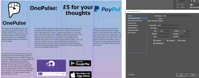


For the images, I added a shadow using the drop shadow option under effects, so the image doesn't look as flat. I then adjusted the distance, offset, and opacity to help it match better with other shadows I was adding to other images.
The logo and background image are from the official onepulse site, while the paypal logo is from the paypal site, and there are also images from the digital storefronts it is available on.

For exporting, it comes out of InDesign as a PDF to import into Photoshop and exported as a JPEG.

Viral Video:
It features about 10 seconds of the John Lewis Christmas Ad from 2019. This is to give context, but is being used without permission.


For some parts of the video, I wanted a logo for the game show. I began by just creating simple text in photoshop and choosing all the formatting and style options.


I then made these options into a style, so I could easily repeat them again for any other text boxes I might have.


This was the setup for the scenes featuring the host (me). I had the two overhead fill-lights to fill the sides of me, orange lights overhead, and a redhead light straight-on to stop the orange lights from overpowering my skin tones. Here, the orange lights are present, but my skin is mostly normal colour. The shot is fairly tight, this prevents the viewer's eye from drifting. There is still space to the sides of me, this is to allow for some movement, and for the video introductions to appear beside me.


There is a scene where I wanted the onepulse logo and app to appear on a screen. The problem was the recording from my phone would have been to low-res for the 1080p video. Because of this, I decided to get an actor to hold their phone up to the camera with a green image on their phone, this would allow me to replace the screen with a white background and place any images I want over it.
I copied the footage and applied 2 brightness and contrast effects to get it to a pure white background on the phone, I then adjusted this so that it was less harsh on the eyes.


Double-Page Spread:

To place in the pictures and text, I used the box tool to create the boundary I wanted, then pressed control+D to bring up the place menu. This allowed me to choose the content I would want to put in. Then I selected fit content proportionally under fitting, so that it would fit the box, but wouldn't be distorted in any way.
Style-Sheets allow for multiple text boxes to have the same formatting quickly, without the need for changing each individual setting for each box. Within Style-sheets are leading and tracking. Leading is the spacing between the lines, and the tracking is the spacing between letters and words. This helped to get the formatting I was happy with.


For the images, I added a shadow using the drop shadow option under effects, so the image doesn't look as flat. I then adjusted the distance, offset, and opacity to help it match better with other shadows I was adding to other images.
The logo and background image are from the official onepulse site, while the paypal logo is from the paypal site, and there are also images from the digital storefronts it is available on.

For exporting, it comes out of InDesign as a PDF to import into Photoshop and exported as a JPEG.

Viral Video:
It features about 10 seconds of the John Lewis Christmas Ad from 2019. This is to give context, but is being used without permission.

For some parts of the video, I wanted a logo for the game show. I began by just creating simple text in photoshop and choosing all the formatting and style options.
I knew that this wouldn't look aesthetically pleasing as just plain text, so I decided to add a shadow. I couldn't find a long shadow option in photoshop, so I decided to turn it into something similar. I began by adding a drop shadow, and increased the opacity, this would remove any transparency. I then increased the distance to give it some depth, and increased the spread to make it more solid, which is closer to a long shadow. I didn't adjust the size too much as it would overcome the text, which isn't the look I wanted.


I then made these options into a style, so I could easily repeat them again for any other text boxes I might have.

After that, I used the polygonal lasso tool to draw out a shape I thought would fit, and then used the paint bucket tool to fill it with the colour I wanted. I chose to use blue as it is a complimentary colour of orange.
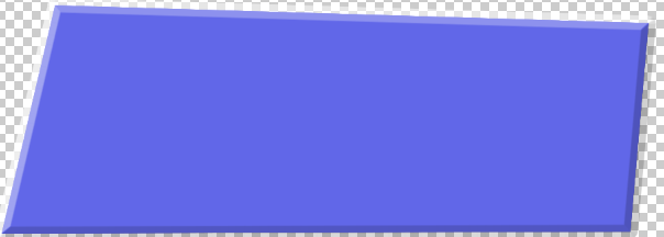

To give it some depth, I added a bevel and emboss effect. This helped give the appearance of the text being raised on some sort of wall or platform. I changed it to chisel hard to get the depth to be clearly visible, with the other options being smooth and not having as defined an edge as I would like.


This was the setup for the scenes with the actors, with the camera on the tripod between the lights. We took the shotgun mic hanging from the ceiling, and mounted it on the camera, plugging it into input 2. This allowed for the audio to be played through both channels, so if I forgot to change it in post, it wouldn't be just in one ear, as that isn't audibly pleasing. This would be the case if I used the internal mic or Input 1.
I began by creating bins to organise things like the music and different types of clips. This would make it easier to find them later.

For clips where there was a gap, either at the front or back, I would bring them into the source window, and use the I and O keys to select only the pieces I wanted, by marking the In and Out points. This would cut down on time later, with not needing to cut them later.

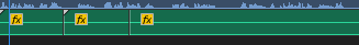
When I had the clips to the right length, I added an adjustment layer. This allows for effects to be put on the video, while not being associated with the single clip. This made it easy for the effects to be present while not bulking up the effects controls for the clips themselves. I added effects such as curves and brightness and contrast to help improve the video.


For the introductions of the contestants, I had the clips scale up and down. This would help make the transition more visually pleasing.

I wanted to have a transition between the footage of me and the John Lewis Ad, so I created a new sequence by going to File > New, and made it match the settings of the rest of the project.

I created an image in photoshop for the main part, and then created another photoshop document slightly larger than the final video, to give me space for movement. I then placed these both into premiere and moved them from right to left, trying to match the speed as much as possible.
I repeated this for the transition between the video and the footage, but changing the text.

Most game shows have a border for any videos they show, I wanted to incorporate this into my ad. I created a new sequence to cut down on items on the timeline. I used the transition photoshop file and put in the title of the John Lewis ad from Youtube. I then exported this. The final image for the border is the logo, the title, an image of marble, and an image of orange lights. I then scaled down the video to fit the border as best I could and set it to start at a point that was recognisable.


The first two clips of music are actually identical. The original song didn't have a long enough lead-in for the video, so I cut the intro from the rest, and duplicated it. This fit the video better. I also adjusted the gain for these and other audio clips to help keep everything at the right volume.

All these clips have the audio for the same clip, but different properties. The first one has no effects, the second has a slight fade to ease the transition, and the final has the lowpass effect, muffling it to place the video in the background somewhere, also allowing for the actors' voices to be heard easier.

This is the original shot. It looks very blue because the camera saw it as cold because it was white balanced for the warm lights in the studio.

To fix this, I used the lumetri colour effect to bring up the temperature. I then keyframed this to adjust to match the scene better.

I copied the footage and applied 2 brightness and contrast effects to get it to a pure white background on the phone, I then adjusted this so that it was less harsh on the eyes.


I wanted some pulses from the app to show on the screen, but they didn't match the perspective of the screen, so I used the corner pin effect to manually adjust the corners to the side-bezels of the phone, then scaled this down.
Some of the images were overlapping on the fingers, so I opened the frame in photoshop, and cut out the fingers, then placed this over the video, this stopped the images from going over the edge of the screen.

The audio in the final section was recorded in the sound booth to allow for a seamless transition between the shots from outside, and inside the studio.
1. You need to put your final double page in here with more screen grabs, with explanations of how you built it.
ReplyDelete2. You also need to put in here screen grabs of the way you created your video in premier pro, again with explanations of what you did.
3. There should be a link to youtube where you video is uplaoded
4. The final double page should be uploaded in a jpg after you have saved it in photoshop from the pdf you exported in Indesign (see me if this confuses you!)
This needs to be done next week / over half term as a final deadline